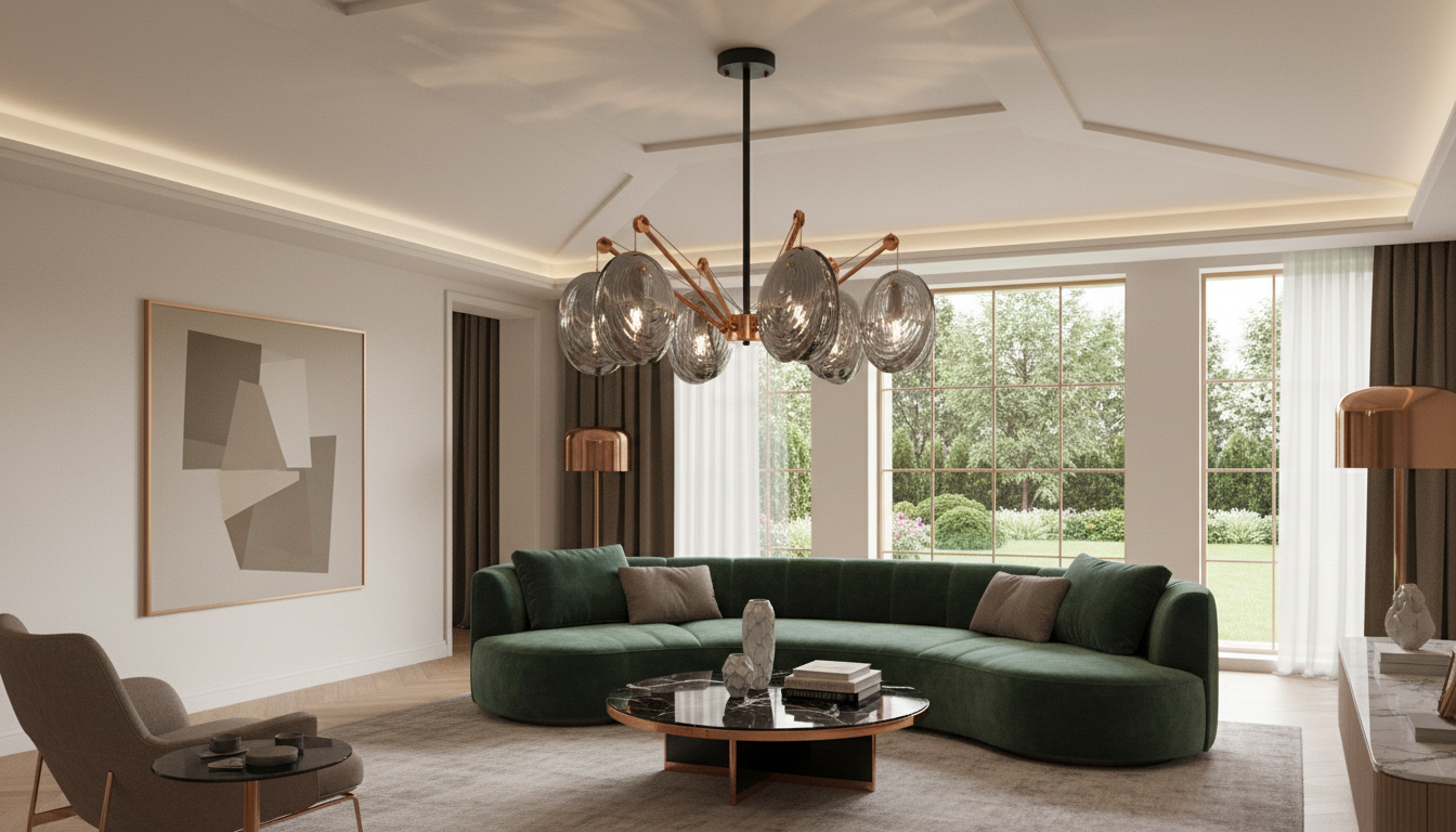
A copper-and-glass chandelier can shift a room from simply furnished to intentionally designed—adding warmth, reflective depth, and a sculptural focal point. Postmodern styling brings clean geometry and art-forward presence, making it a strong choice above dining tables and in living rooms where lighting should feel both functional and atmospheric. Copper delivers a rich, welcoming glow; glass keeps the silhouette visually light while helping the room feel brighter and more open. For more guidance, see Issue 10 | Cornell Journal of Architecture.
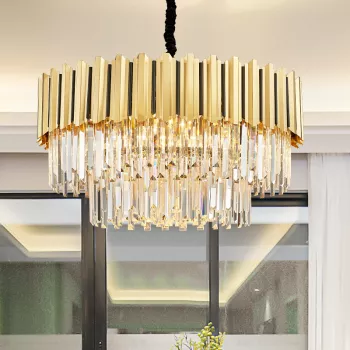
Copper and glass work because they do two different jobs at once: copper adds depth and warmth, while glass keeps things crisp and luminous. Copper tones tend to flatter warm whites, creams, walnut, and natural textiles—and they pop against charcoal, deep green, and matte black accents. If the space already includes reflective materials (mirrors, polished stone, lacquered cabinetry), glass components echo that sparkle without turning the room overly glossy. For further reading, see LED Crystal Gold Chandelier Light.
Placement is where a chandelier goes from “nice” to “effortless.” The goal is comfortable clearance, clean symmetry, and a scale that feels confident without crowding the room.
Center the chandelier over the table and keep the fixture width narrower than the tabletop. This prevents visual crowding and helps maintain clear sightlines between diners. If the table is long, prioritize centering to the table (not the room) so the lighting feels purposeful.
In a living room—especially a large or open-plan one—align the chandelier with the primary seating zone (often the coffee table centerline) rather than the overall room footprint. This keeps the fixture from feeling “adrift” when the room has multiple functions.
| Space | Recommended hang height (from floor) | Clearance rule of thumb | Suggested light tone |
|---|---|---|---|
| Dining table | 30–36 in above tabletop (adjust for ceiling height and fixture scale) | Keep edges of fixture inside table perimeter | 2700K–3000K warm white |
| Living room seating area | 7–8 ft from floor to bottom of fixture (or higher for tall guests) | Avoid blocking walking paths and sightlines | 2700K warm white |
| Open-plan dining + living | Visually align fixture height with other pendants/fixtures nearby | Use consistent finish tones across zones | Dim-to-warm or 2700K on dimmer |
A chandelier looks best when it’s part of a layered lighting plan: ambient light for overall glow, plus task and accent lighting for depth. The American Lighting Association outlines how these layers work together to make a space feel comfortable and functional (ambient, task, and accent lighting layers).
A common guideline is about 30–36 inches above the tabletop, adjusted for ceiling height and the fixture’s visual scale. The best height keeps clear sightlines across the table while still feeling centered and intentional.
Warm white light around 2700K–3000K tends to look best because it enhances copper’s warmth and keeps glass reflections soft. A dimmer adds flexibility so the room can shift from bright to ambient without changing bulbs.
Yes—treat the chandelier as a zoning tool by aligning it to the dining table or main seating group rather than the entire footprint. Keep finish tones consistent across nearby fixtures and use dimming to balance brightness between areas.










Leave a comment